There is a special way in which a piece of embroidery in the working takes on a evolved beauty as it progresses. One can start with the backbones of a design or a particular element. As colour or detail are added, there is a genuine maturation of a design as it approaches its fullness. Seeing the change to a piece as each progressive element of a design is added is one of the things that gives me real pleasure in embroidery.
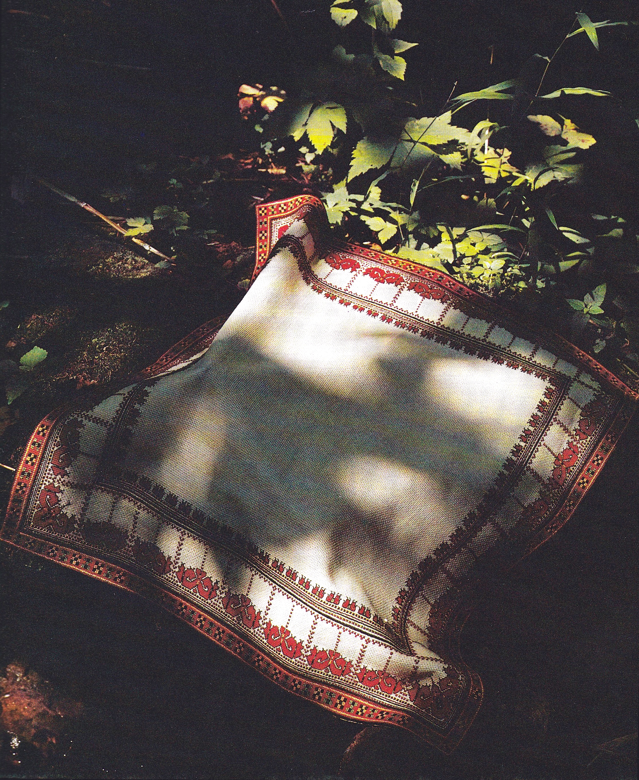
Here I would like to share such a progressive development of a beautiful and majestic embroidered piece, from start to completion. The piece on which I’m working currently is a servetka, and quite a large one.
It begins with an idea, usually with a design that has caught my eye, which I would like to see actualised, or otherwise with a fabric I want to decorate, or with a colour I want to celebrate. In this case, it was something of all three.
There is a fabric on which I have worked before and which I really love.
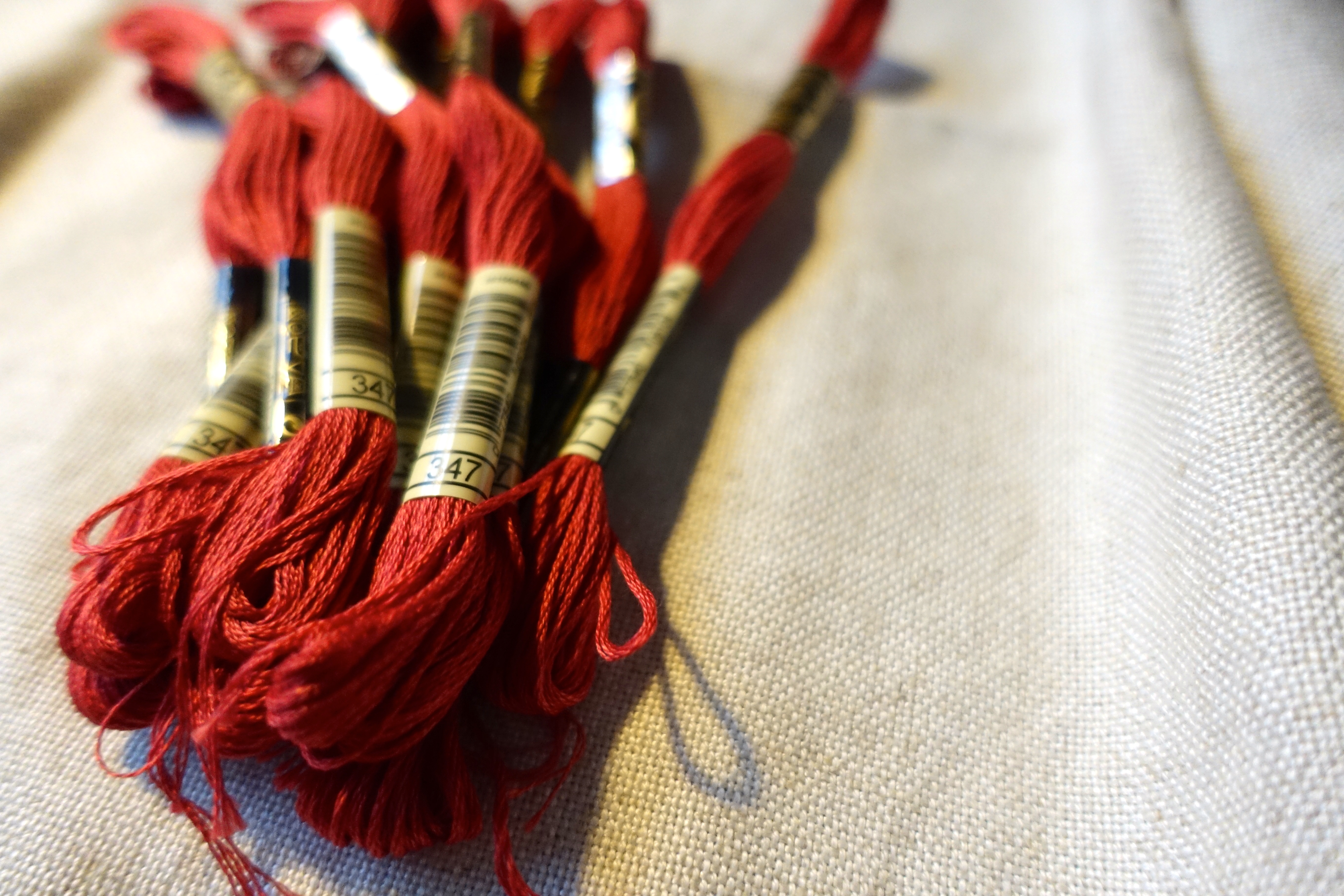
A red colour I adore is a little faded, a little pink, a little vintage.
And a design of which I’ve long thought, found in a book called Invincible Spirit, Art and Poetry of Ukrainian Women Political Prisoners in the USSR INSPIRATIONS.
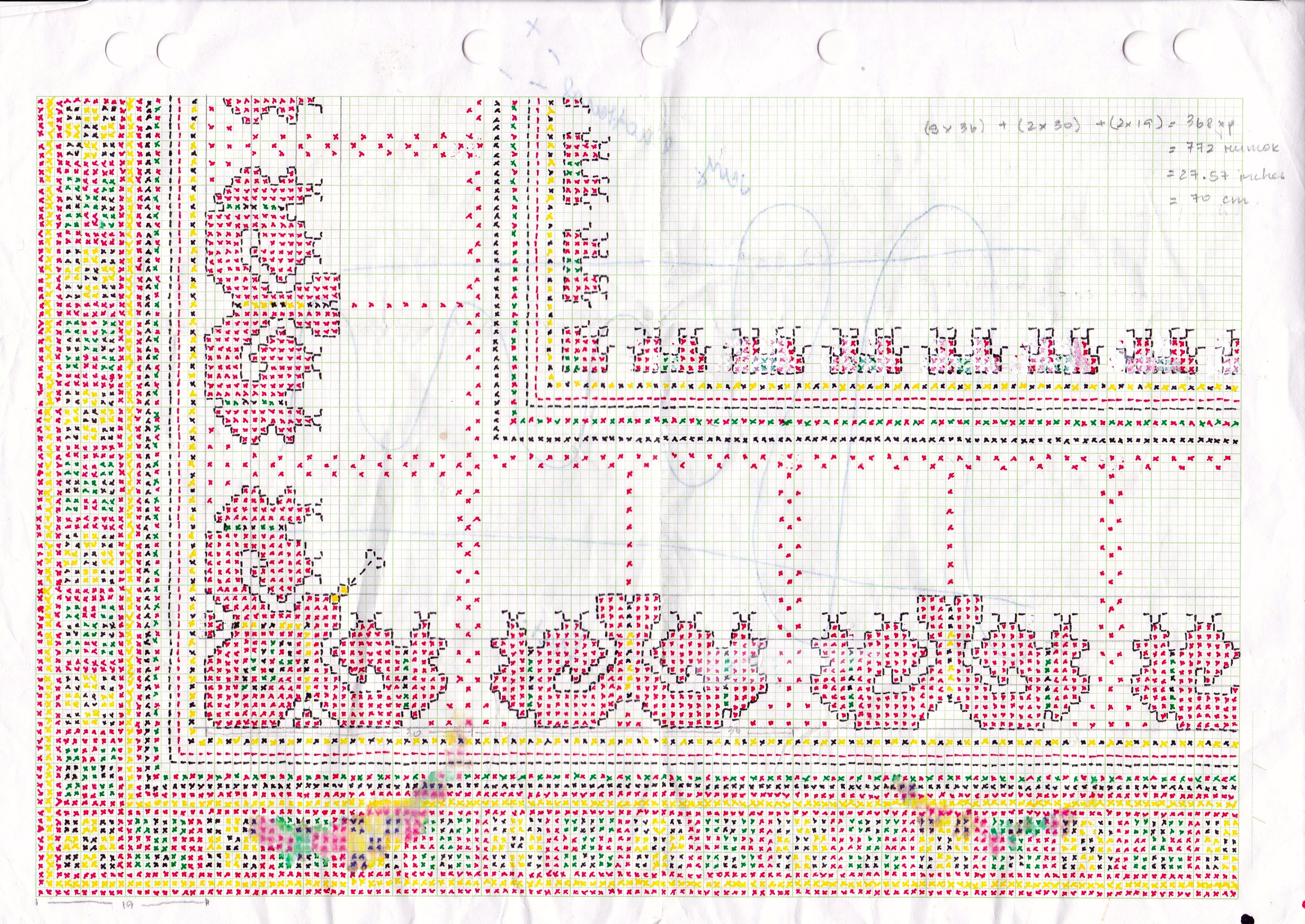
It is graphed out, as per my usual habit.
And embroidery begins.
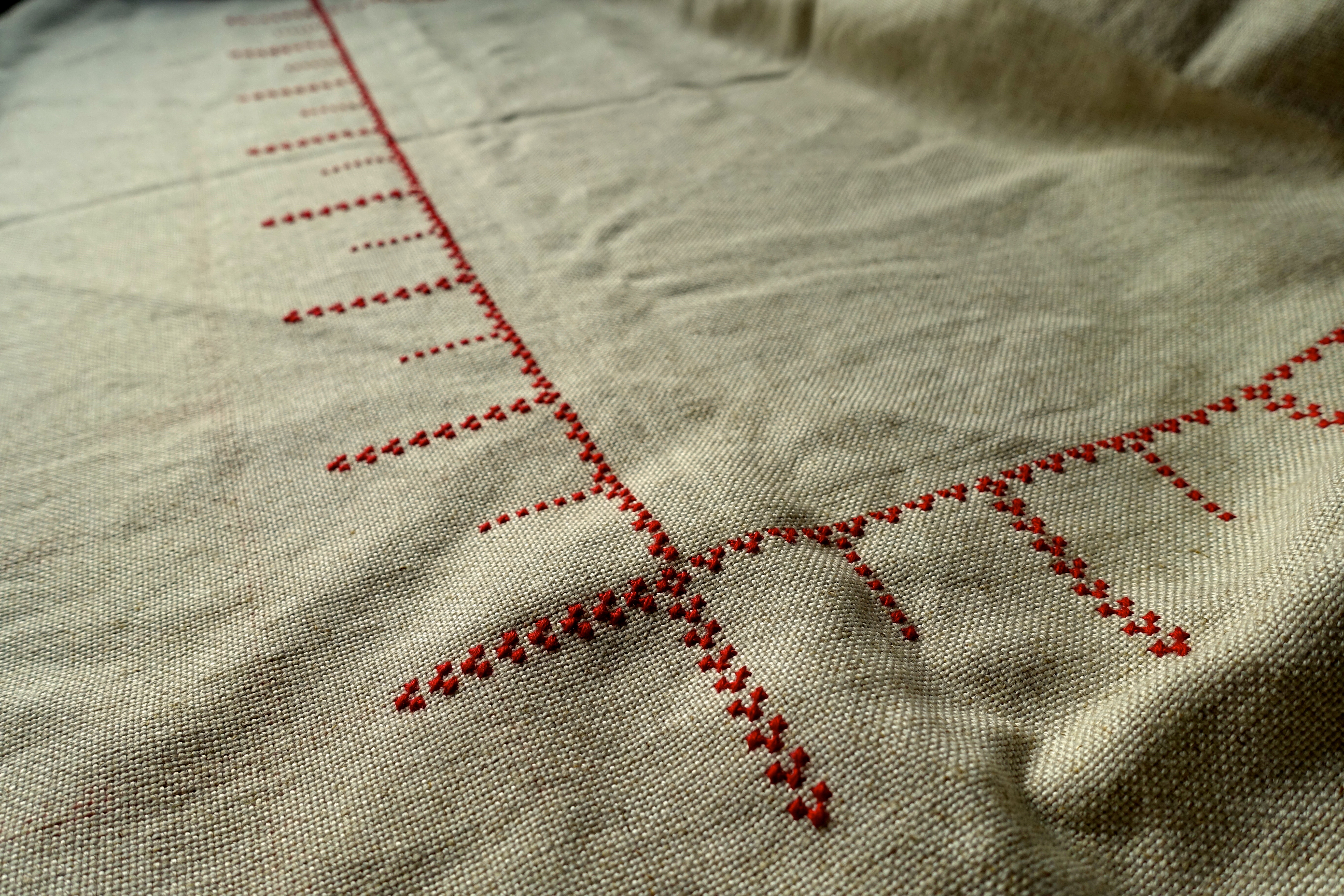
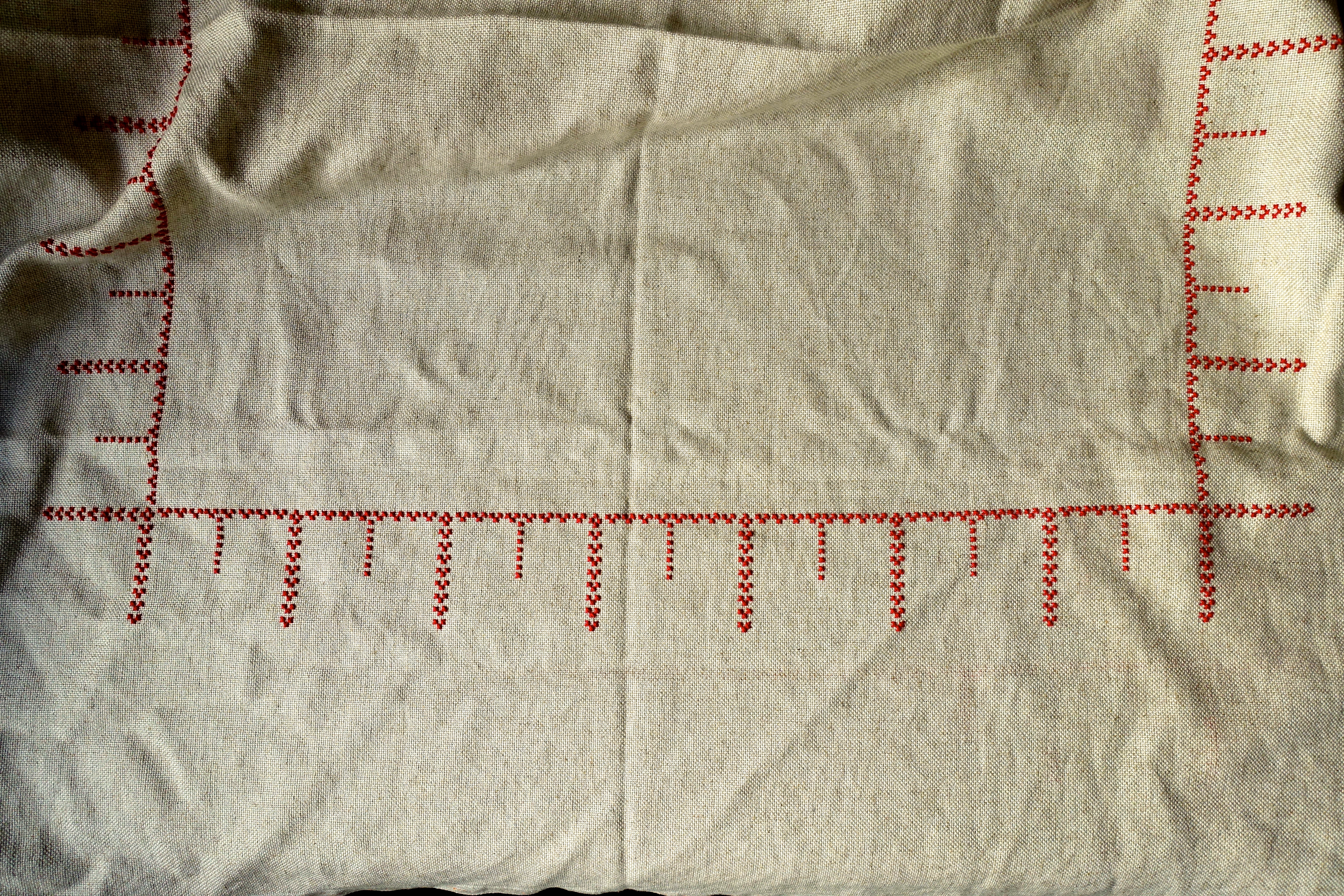
So far, it looks quite unexciting, but the size and scale can be appreciated. This looks straightforward, but I actually made a lot of mistakes inserting a diamond of crosses in amongst the teeth periodically.
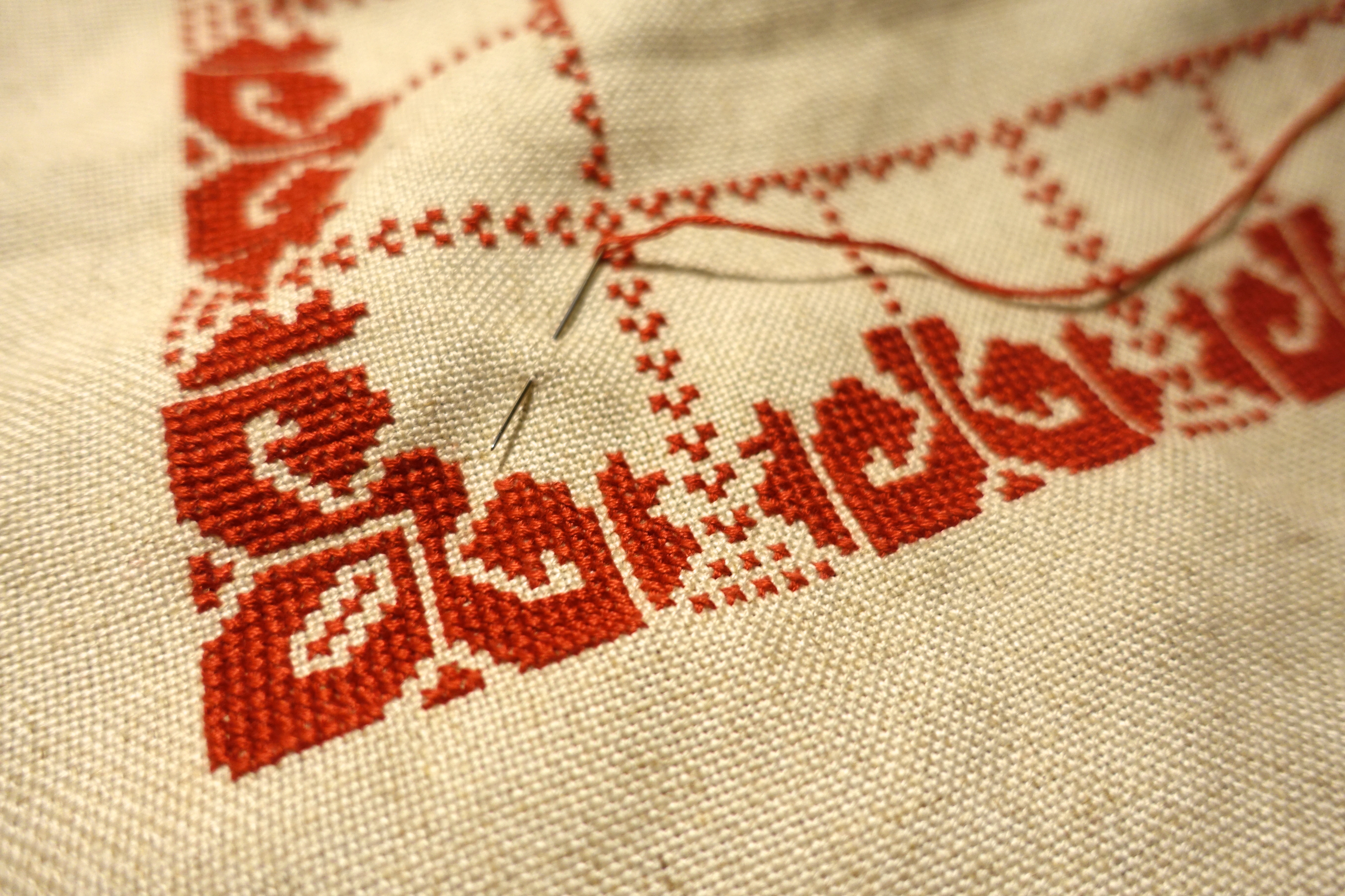
Adding these strange, exotic flower-like shapes was substantial.
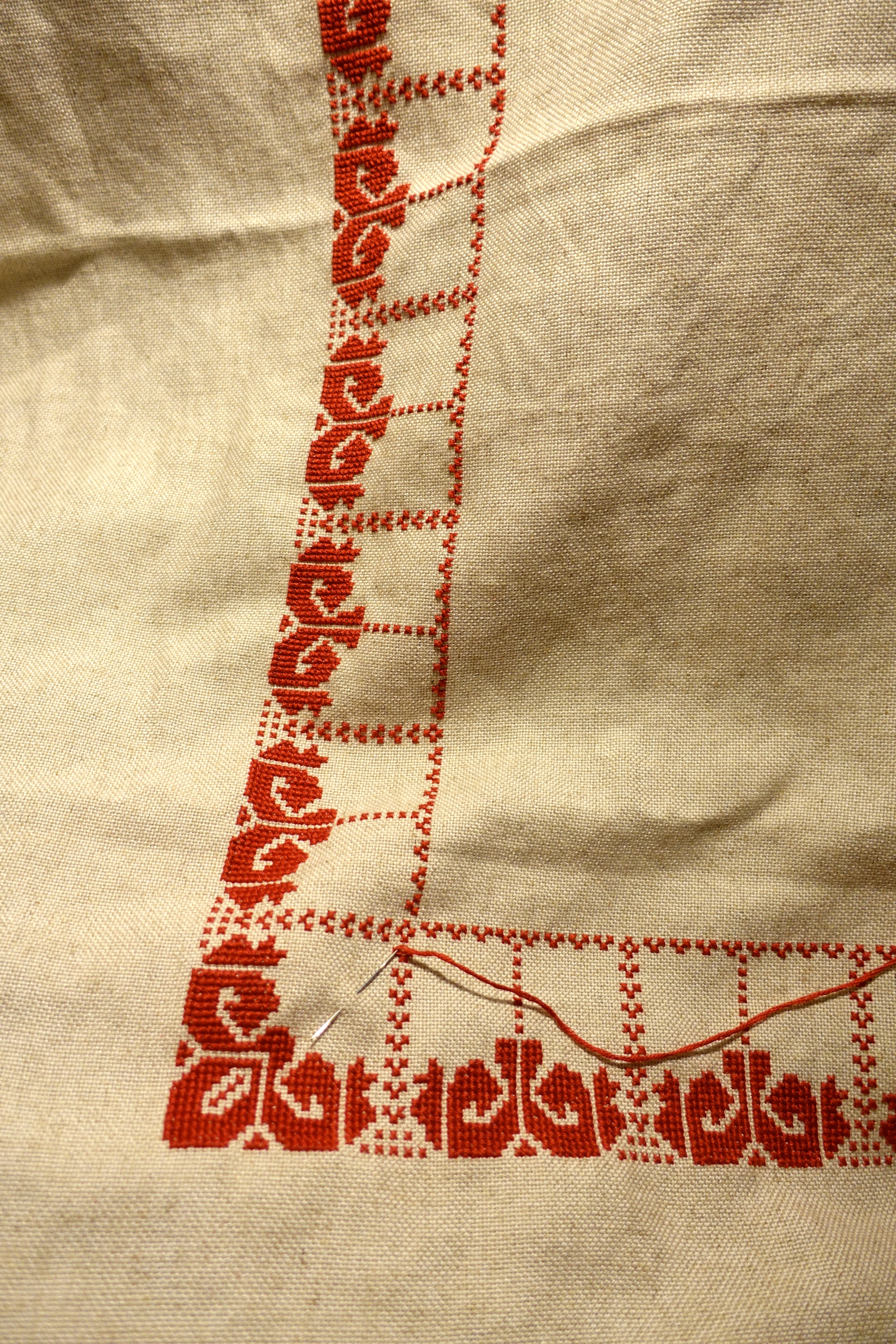
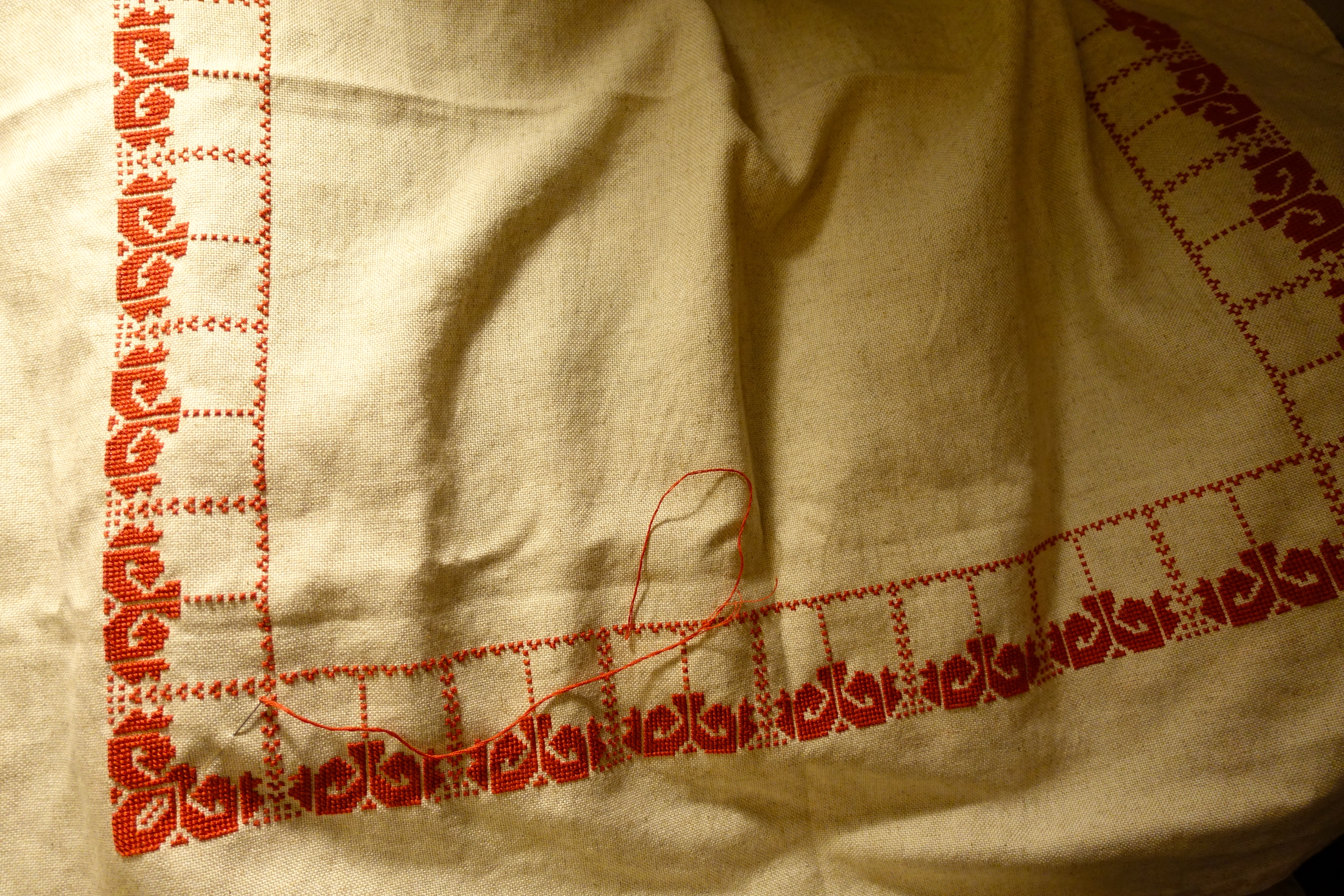
Here, they are completed. There is some form, a major element in the design is added, but the composition itself is looking still a little plain and unexciting.
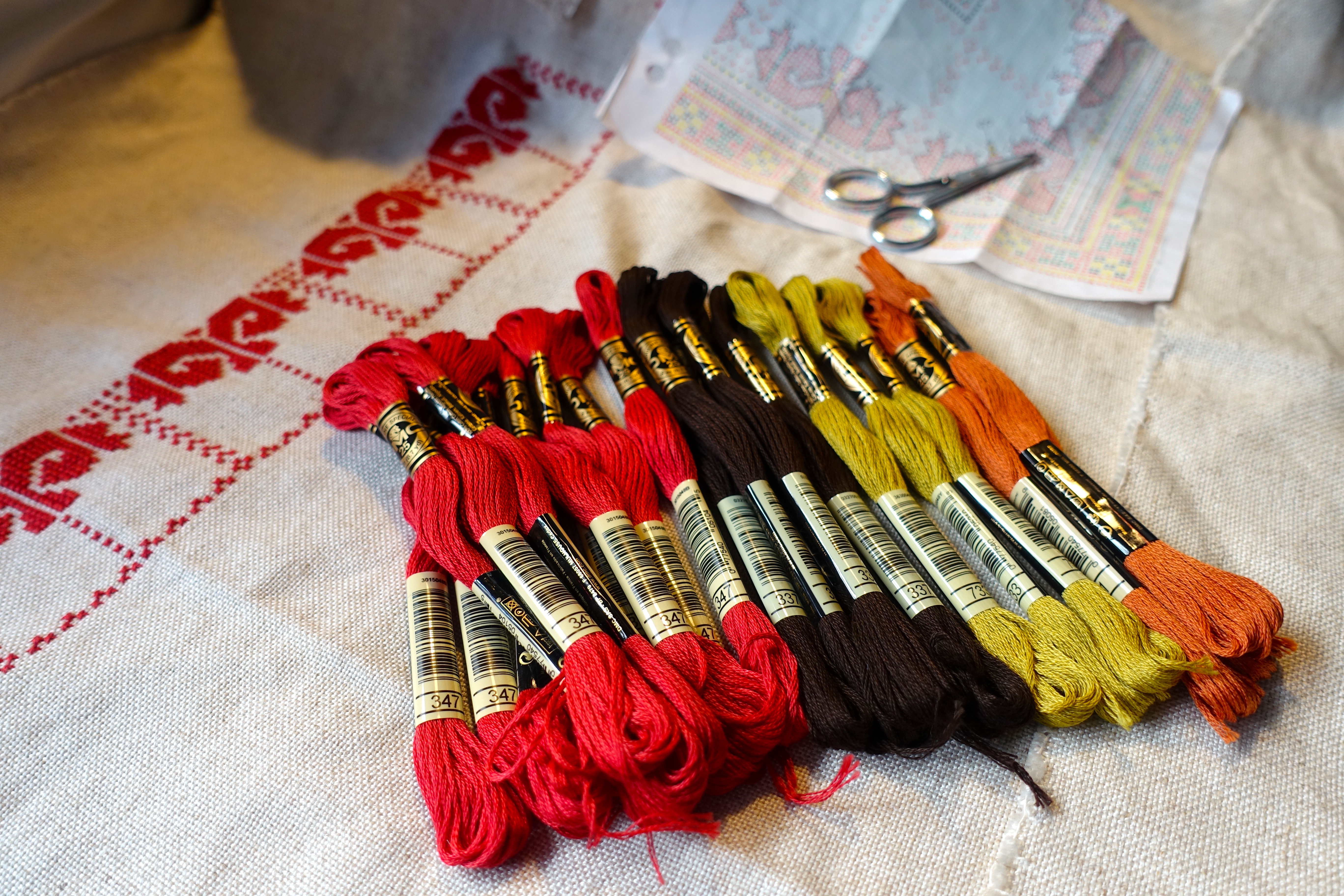
The next step will be to begin adding some detail to these exotic poppies and that means choosing additional colours. The design, like many Ukrainian designs, uses a combination of red, black, yellow and green, a well-used combination. I was really conflicted about the use of black on this particular piece. When I’ve laid down black cross-stitch in the past, it has sometimes looked heavy and abrupt. And here I have such a soft flecked fabric colour and slightly faded, gentle red. Black didn’t sit with me at all.
I’ve seen embroideries in people’s homes, my Baba’s embroideries included, on a grey/brown fabric, looking very vintage in oranges and browns… so why not a very dark brown as an alternative to black? I pulled out from my drawers the darkest brown available from the thread range, after which it made no sense to use a pure green or definitive yellow, or any yellow at all.
So after some fiddling and shuffling of colours I settled on a golden, pale green and coppery orange.
I’ve embarked on the trimmings and details that will made this design spectacular. I look forward to seeing it evolve and sharing more of its detail and beauty as it comes along.
~oOo~
